Seven Mile initially came to me when they were preparing to launch their brand-new business and wanted help with their logo design and visual identity.
They were looking for an identity to encompass all aspects of their equine business from livery to training and rehabilitation. They also wanted to future proof for any additional services they might develop over time and they wanted the identity to set them apart from their competition and be totally unique.
In our initial discovery meeting we discussed brand values, tone of voice, customer profiles and did an in depth competitor analysis. From this I was able to pull together moodboards with reference images conveying my initial thoughts for feedback and based on their comments I created three initial concepts for the identity.
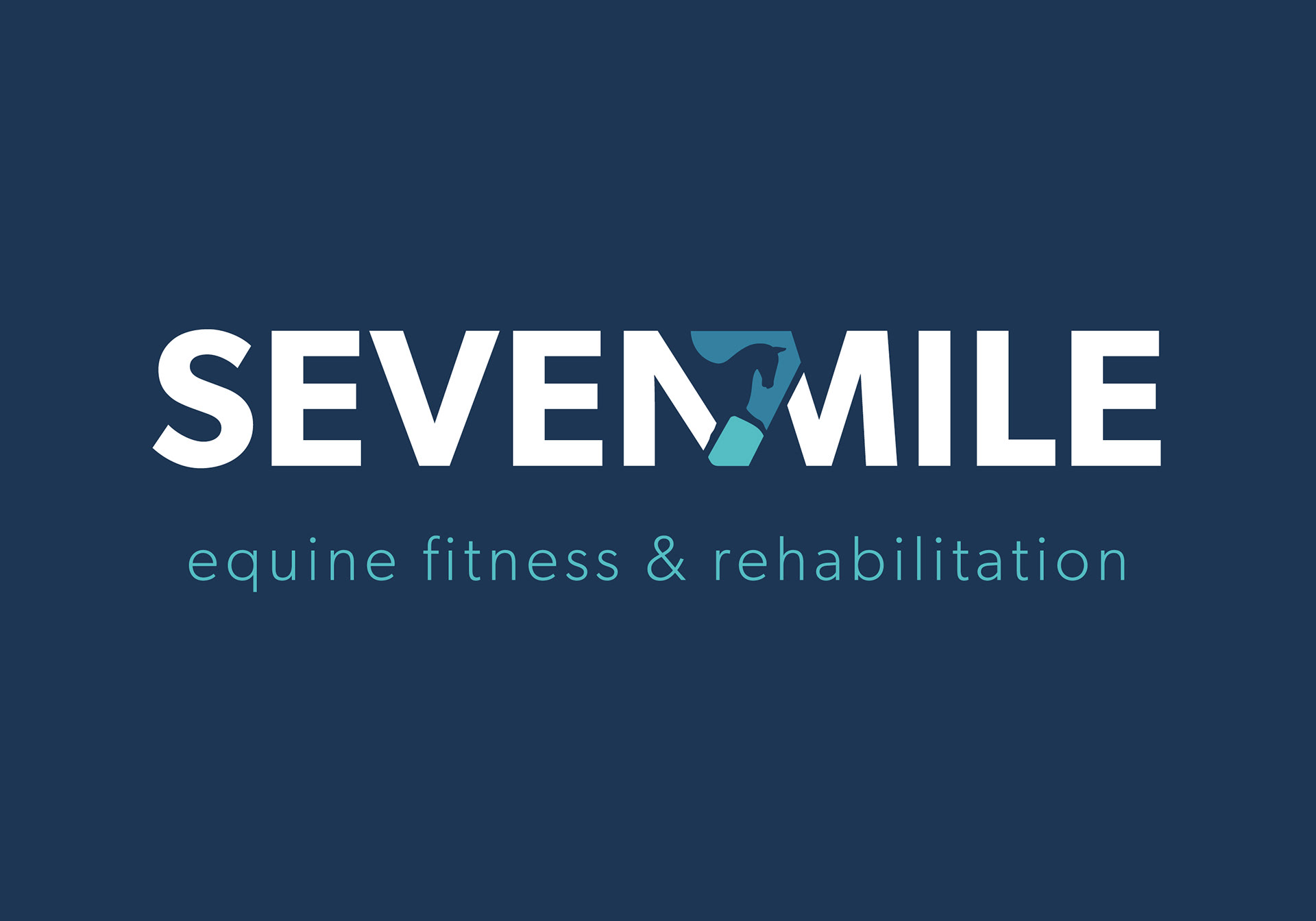
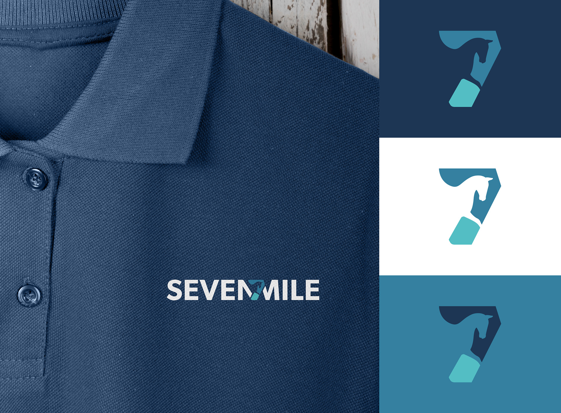
The chosen design uses a number seven created by the negative space from a horse silhouette which could be used as a stand-alone icon and also within the text. The final look is very iconic, easily recognisable and gives them a lot of stand out in their marketplace.
The primary colour palette was influenced by water to reflect the water services they offer to the horses, with additional warmer accent colours which reflect the caring nature of their business. I also advised on suitable typefaces to be used in print and online.
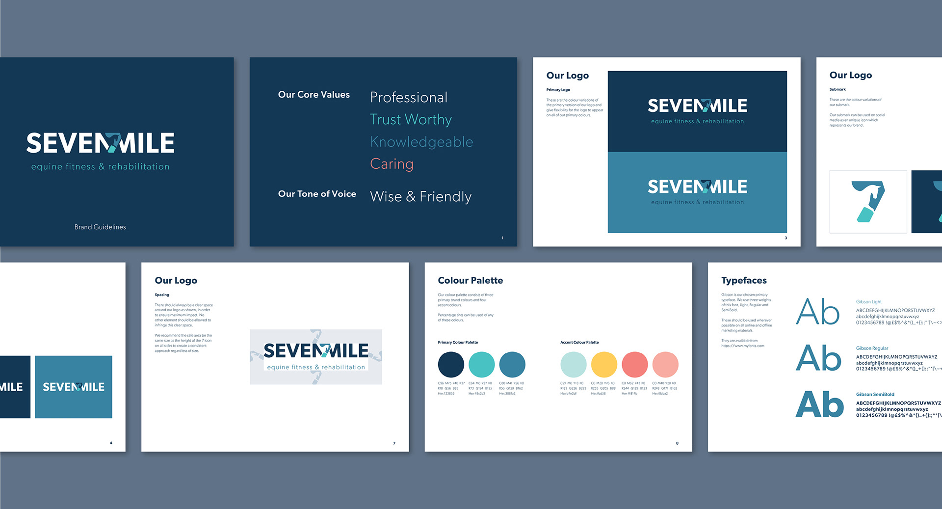
Once we’d agreed on all of the aspects of the identity I put all of this information together in a set of guidelines so they could ensure consistency when creating their website and any future graphics.
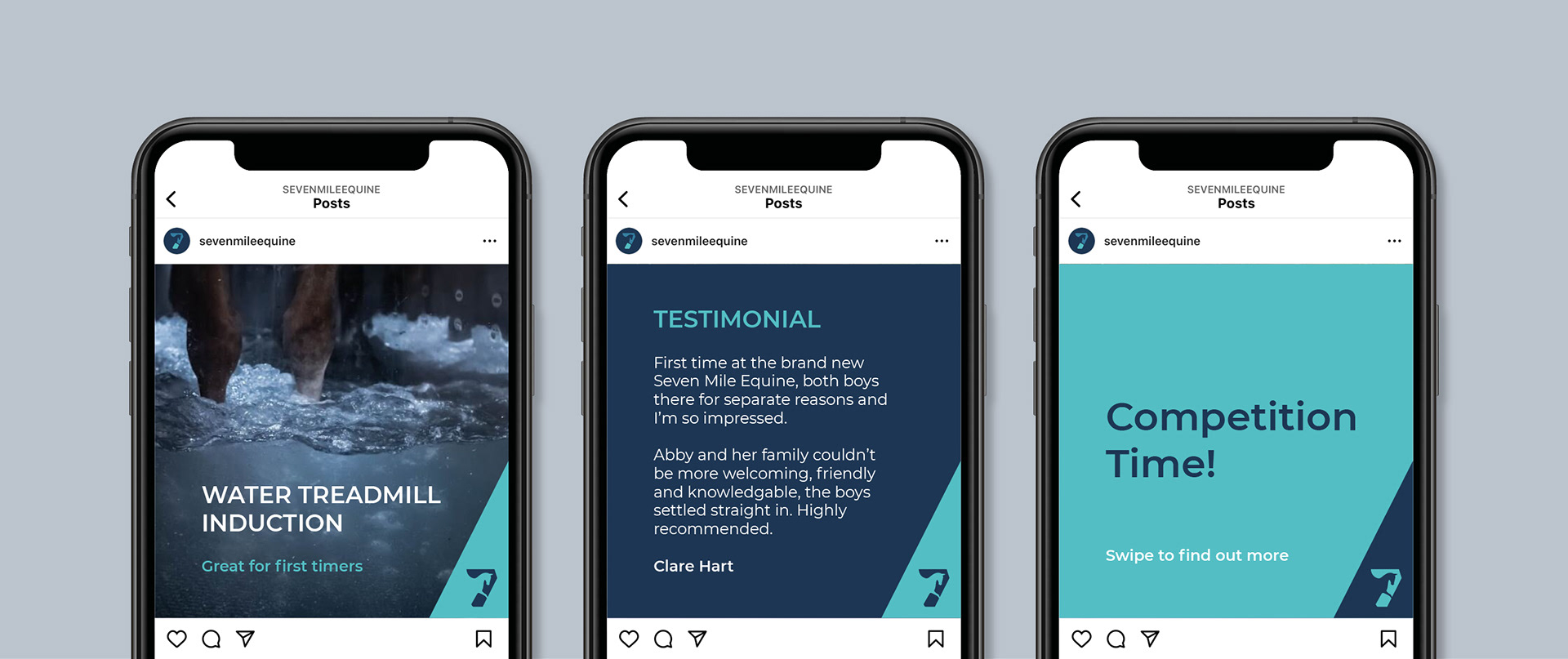
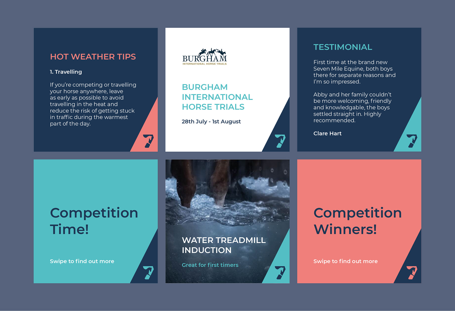
Further down the line once the business was up and running, Seven Mile came back to me looking for a way to give their Instagram feed a more professional and consistent look. I worked with them to create a series of Canva templates that they could easily update themselves as needed.
By using the negative space left by the Seven icon, I created a corner branding device that could be used across all of the templates, making their posts instantly recognisable. I also utilised their colour palette to give stand out to special offers and events.
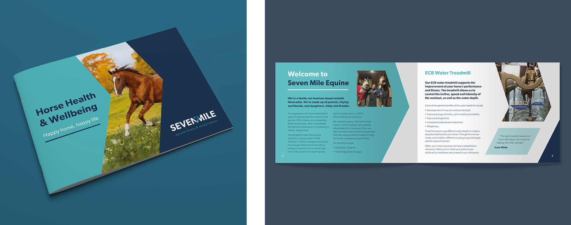
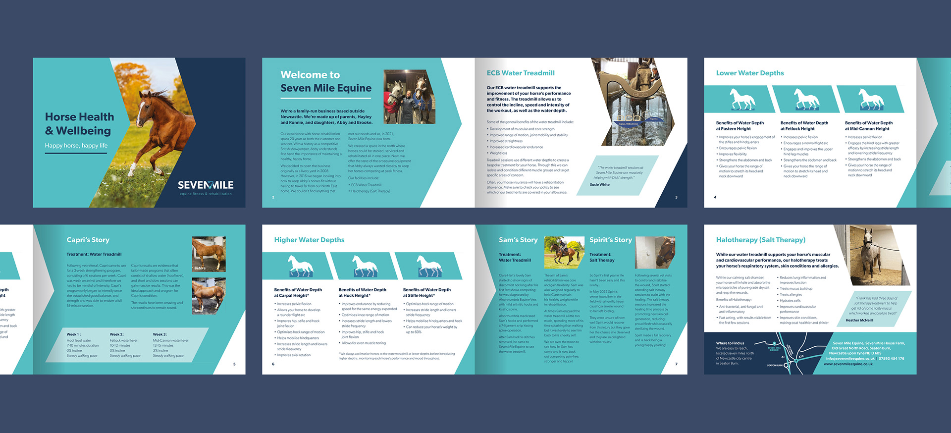
In early 2023, now an established business, they wanted to invest in some printed brochures that would help get their message out to new audiences and promote their varied services. The first step was for me to recommend a format that would work with their content. We decided to go with an A5 brochure which could easily be posted.
Next I created designs for a cover and an initial spread get across my idea for the brochure. The concept further develops their brand style by using the dynamic shapes from the identity to emphasise speed, agility and fitness. They were really happy with the proposed design and so I was able to work up the rest of the pages and supply them with artwork ready for print.
It’s been really great to work with Seven Mile in this way to help them develop their brand over time.
If you have a similar project you’d like my help with please get in touch