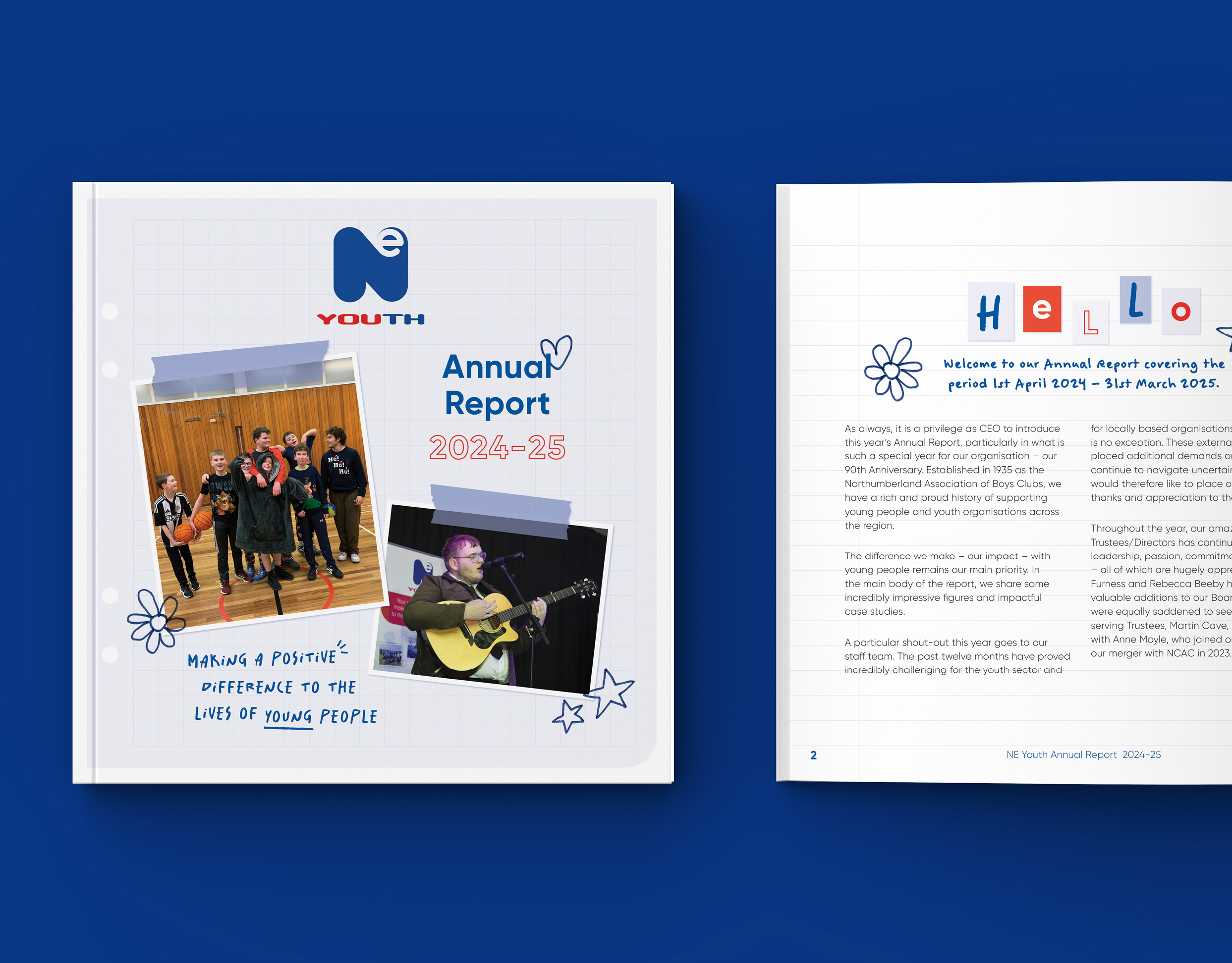
NE Youth is a charity that supports young people all across the North East of England. For their 2024 annual report they wanted to find a way of celebrating the 12 local authorities their work covers.
We decided that by illustrating a landmark from each of the local authorities the design would not only resonate with people from each of the areas but also showcase the North East as a whole.
Initially I spent time researching the different areas to find landmarks that stood out to local people and then I used my illustration skills to bring each of them to life. I went with a graphic illustrative style that works well with the charities distinctive colour palette and brand style.
My next step was to work up designs for the front cover and couple of the internal spreads, so I could check my vision for the design aligned with the clients, before completing the rest of the report.
The feedback on the initial design was really positive so it was now time for me to work up the rest of the pages. This roughly took around ten days, then I was ready to send the first proof of the whole report for checking.
I include two rounds of amends in all my client quotes, but the edits for NE Youth were very minimal, which I put down to the great working relationship we have after five years of working together.
Once all of the amends were completed the artwork was ready to go to print and I also supplied a low res pdf for use on NE Youths' website and social channels. Altogether the project took four weeks from initial meeting to supplying artwork.
