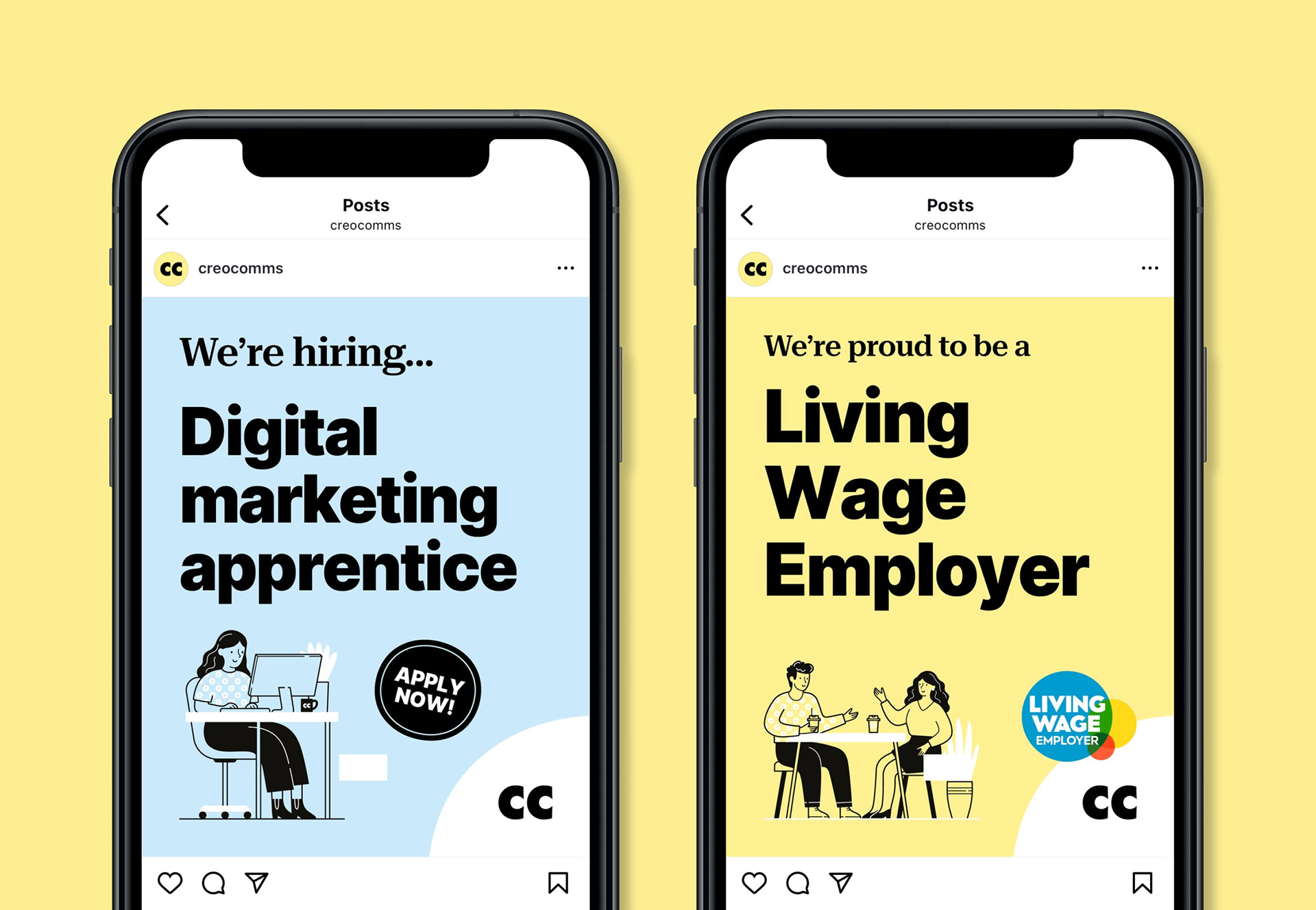
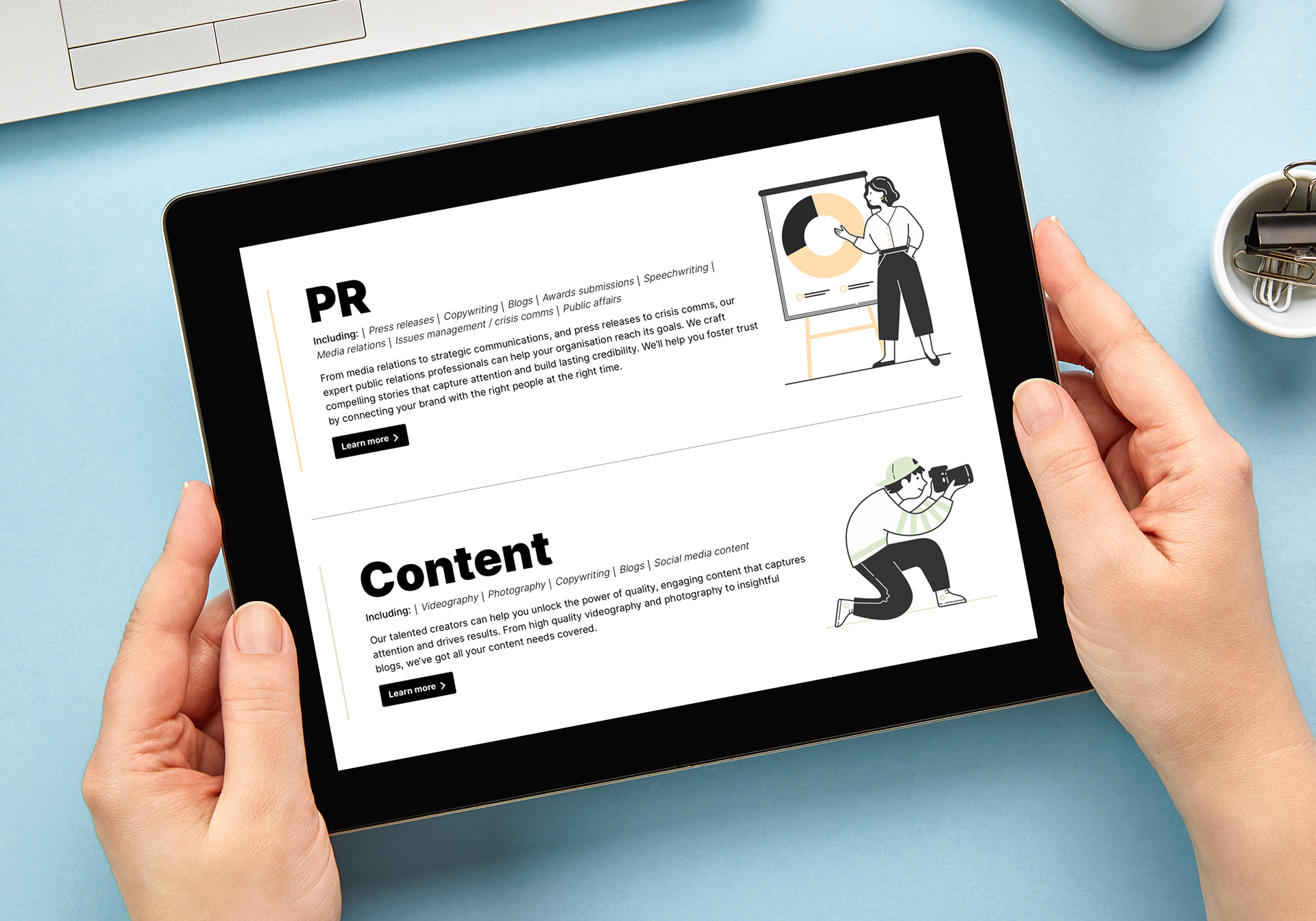
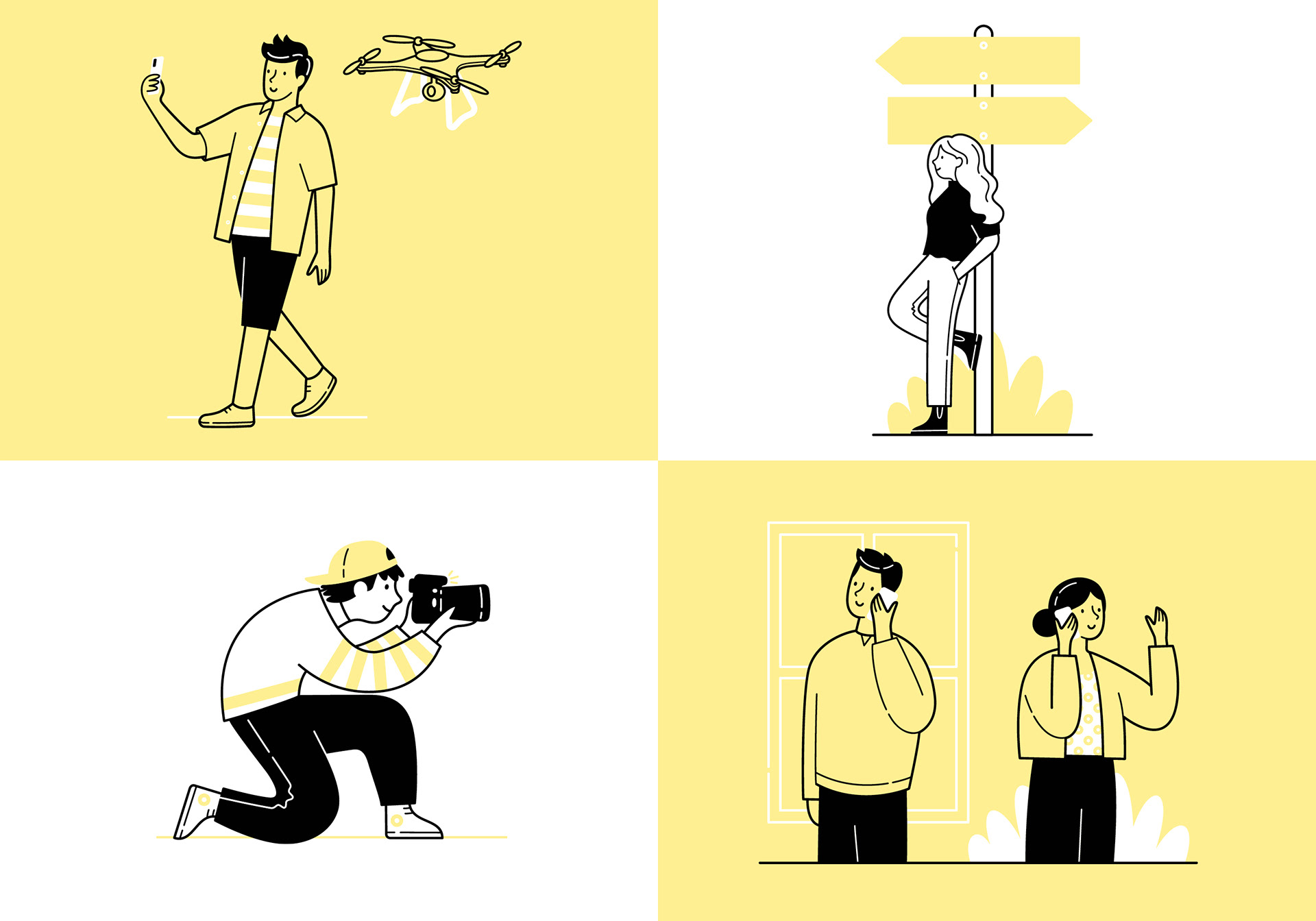
I was approached by Creo Comms, a full-service creative marketing agency, to create a series of illustrations to be used across their website and social media. They were in the process of rebranding and wanted a bright, positive, bold new look.
They had an illustrative style in mind that had lots of energy and felt that my style would work well with the new branding.
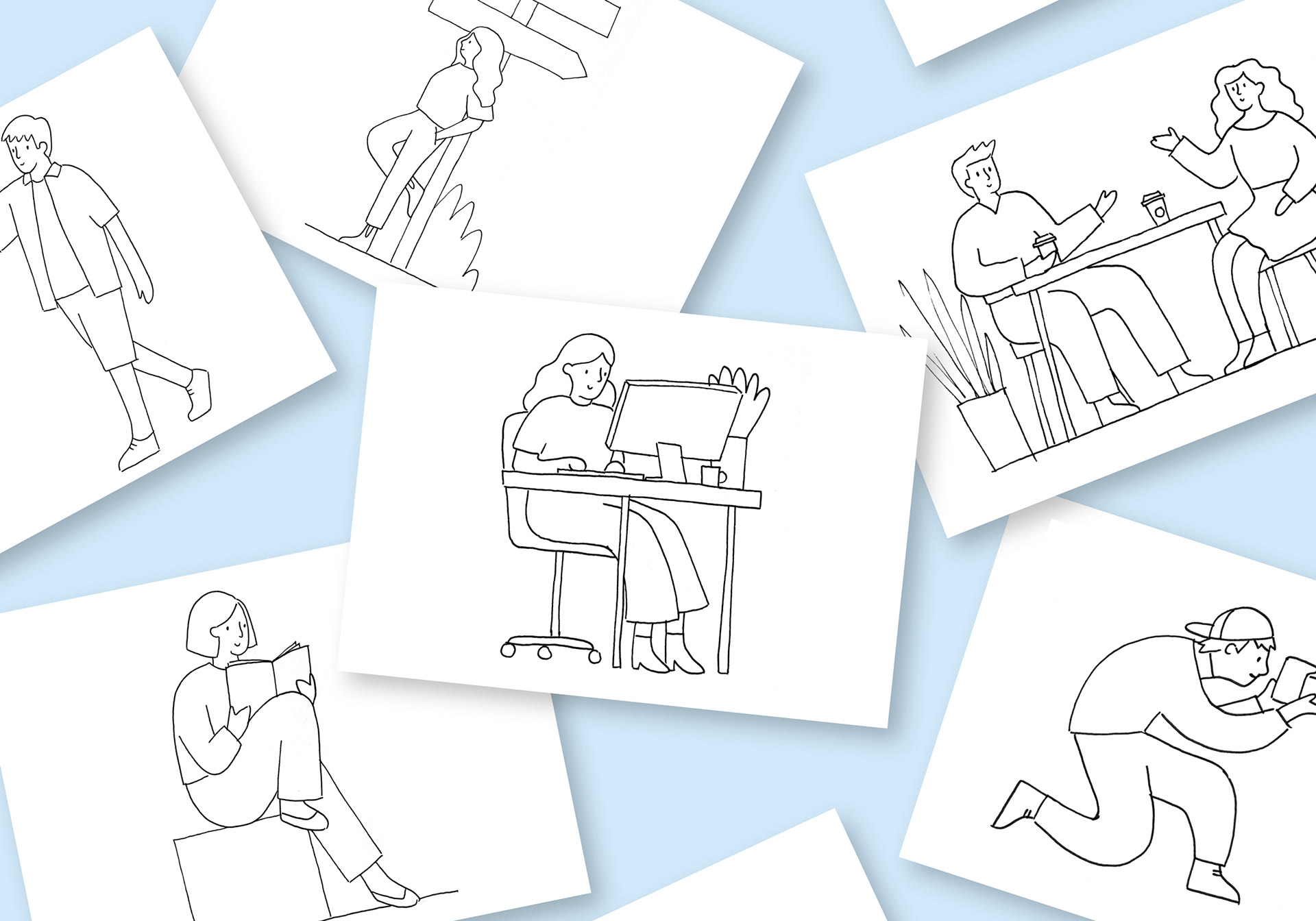
I started by creating sketches to get the content and composition approved before working up the first of the illustrations to ensure the styling met their expectations. Based on the feedback I then worked through the rest of the series.
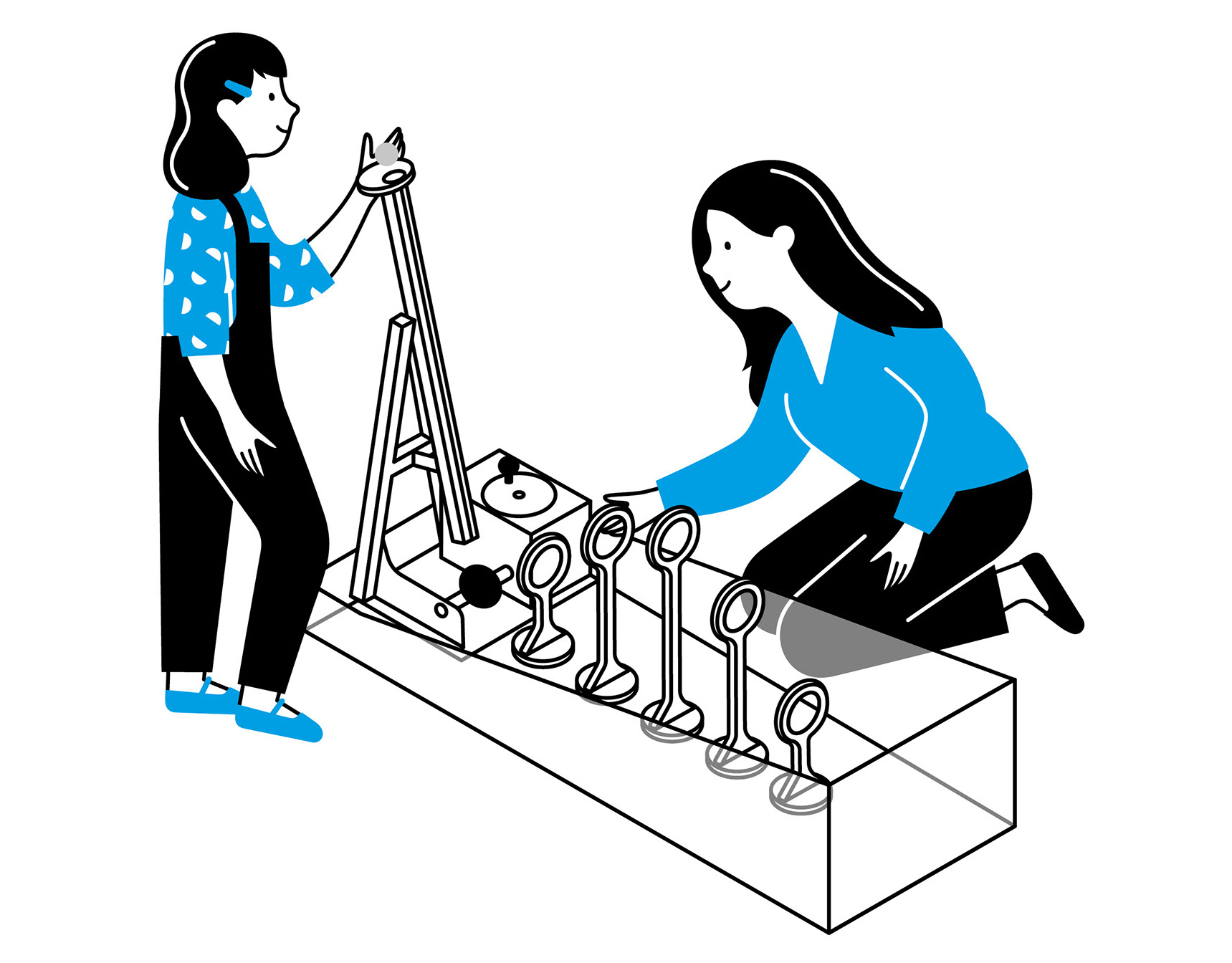
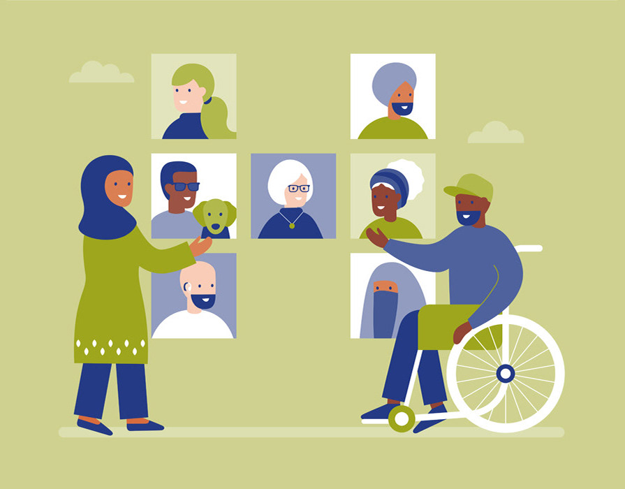
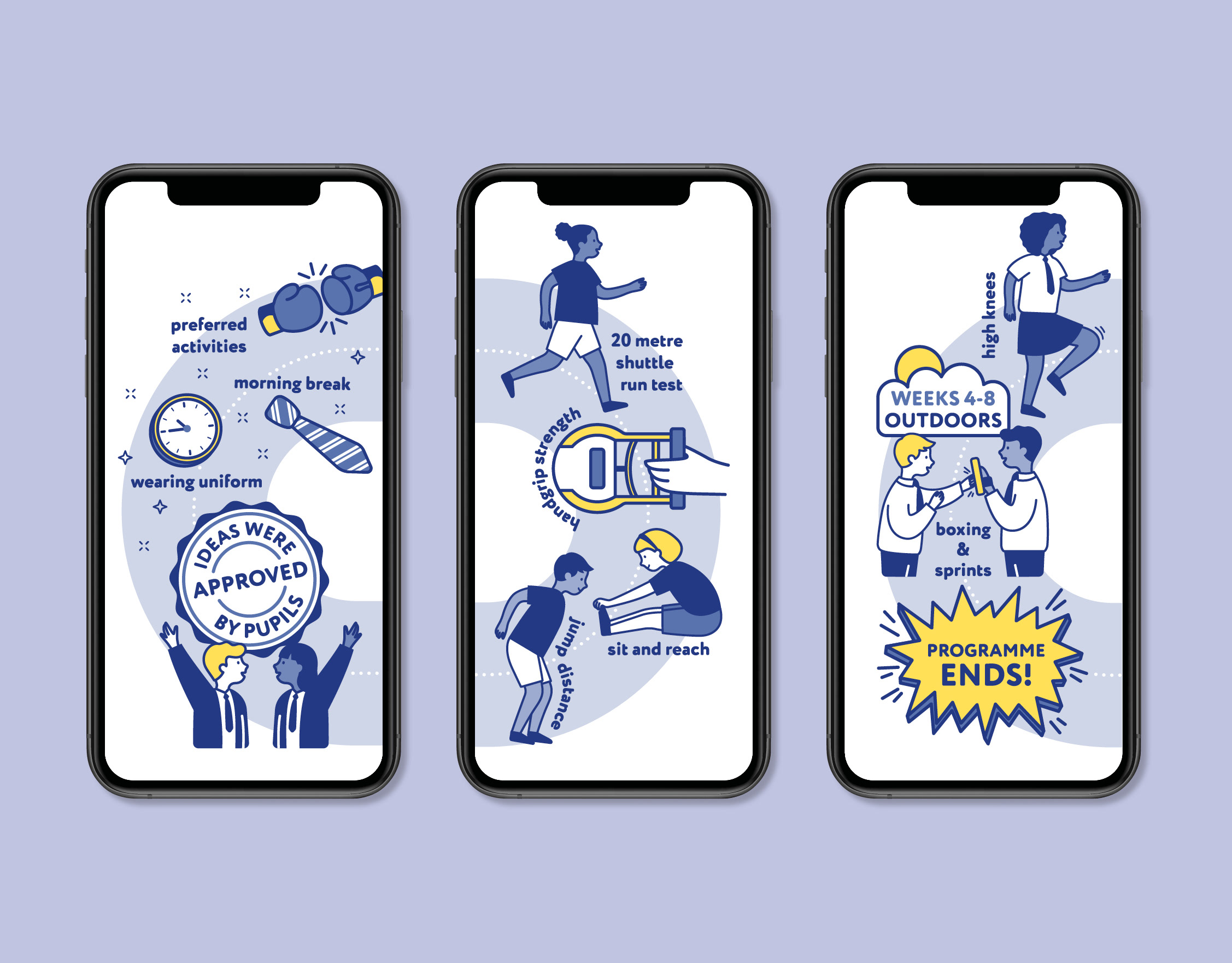
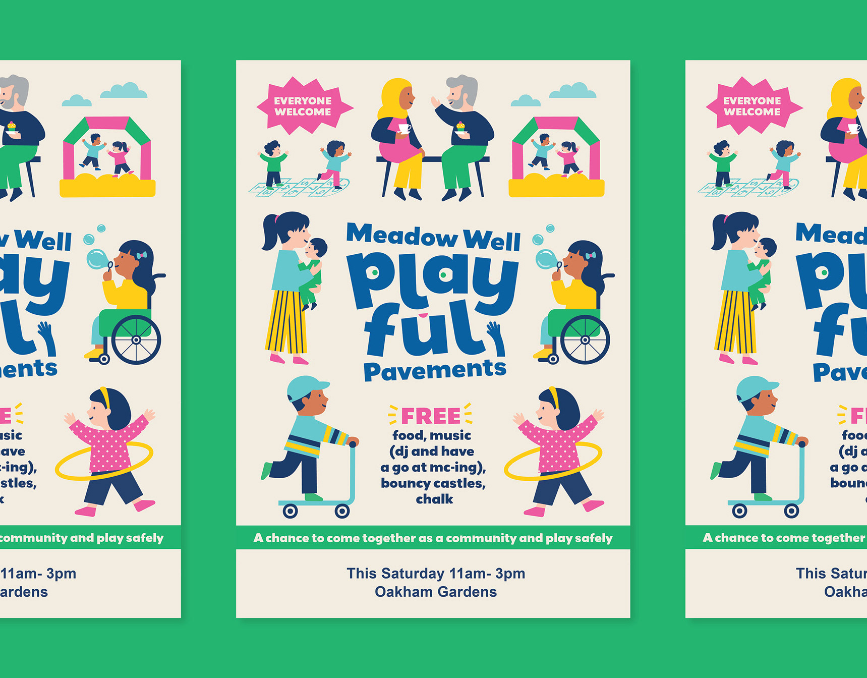
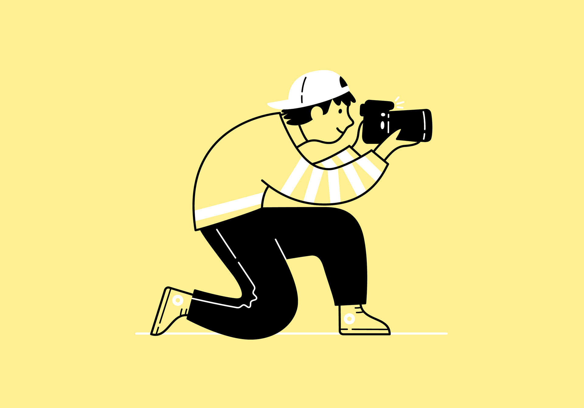
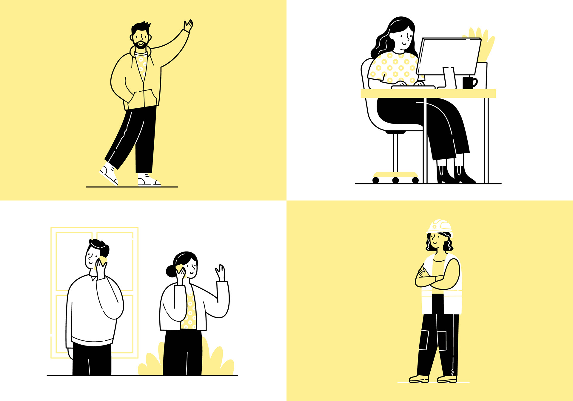
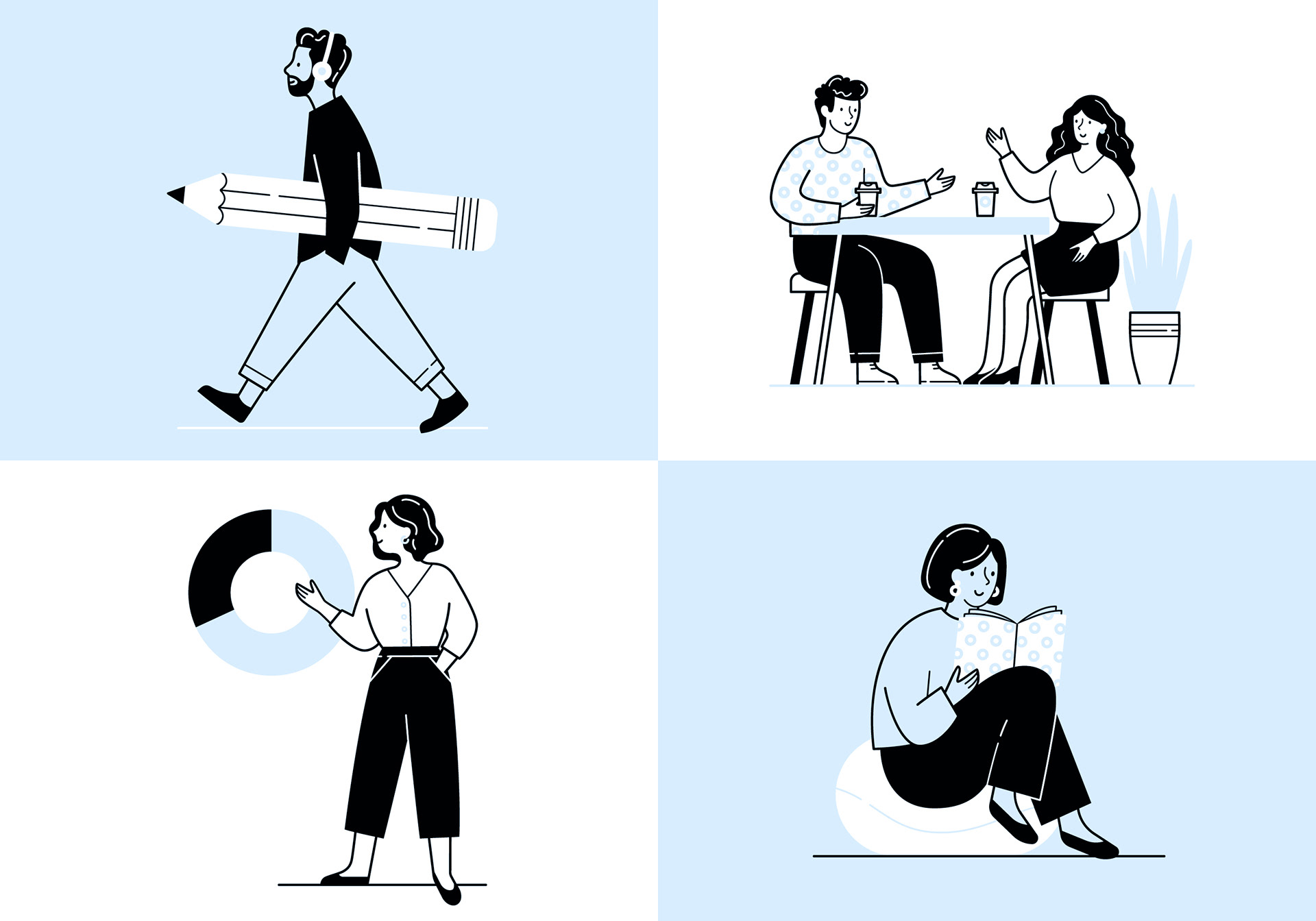
The final illustrations are created in a bold flat vector style that utilises Creo's bright new colour palette and incorporate fun elements from their branding.
Here's some feedback from Chris on how he found the process
"When working on our re-brand at Creo Comms, I was keen to add an illustrative element to the design. As soon as I had this in my mind, I knew I needed to reach out to Sharon. Having worked with her for many years, I knew she would bring our initial thoughts to life and really make them awesome."
"We met up to discuss the project over a coffee and I knew the project was in good hands. When the initial concepts came through a few days later they blew me away and went down so well internally. The illustrations really captured the tone we were looking for and the little details Sharon incorporated really made them unique and so Creo."
Chris Pescod, Senior Manager, Creo Comms

If you have a branding project that could benefit from some bespoke illustrations please get in touch